For a number of years NALP has prepared a graphic to illustrate the bi-modal nature of the distribution of salaries obtained by law school graduates. Over the years the graphic has illustrated that about half of salaries fall into a left-side peak, currently in the $55,000 - $100,000 range, and that the large firm salary typical at the time the class graduated produces a sharper peak to the right.
Also, since 2009, an "adjusted" mean has been calculated in addition to the mean calculated based on reported salaries. Essentially, the adjusted mean compensates for the fact that the distribution of reported full-time salaries is not the same as the distribution of reported full-time jobs, particularly when it comes to law firm jobs. Whereas salaries for most jobs in large law firms are reported, only about half the salaries for jobs in small law firms are reported, meaning that their contribution to the mean is understated whereas the contribution of large firm salaries is overstated. The adjustment is accomplished by giving more “weight” to the mean or average salary in small firms and less “weight” to the mean or average salary in large firms to calculate the adjusted mean.
View salary curves from prior years
Distribution of Reported Full-time Salaries – Class of 2024
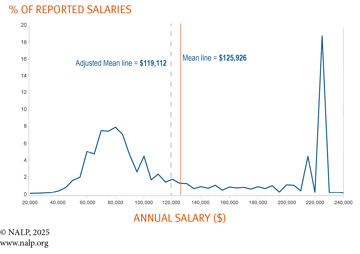
Note: Graph is based on 24,937 salaries reported for full-time jobs lasting one year or more — a few salaries above $240,000 are excluded from the graph for clarity, but not from the percentage calculations. The peak on the left side of the graph reflects salaries of $55,000 to $100,000, which collectively accounted for more than half (53.0%) of reported salaries. The two peaks on the right side of the graph show that salaries of $215,000 accounted for 4.4% of reported salaries and salaries of $225,000 accounted for 18.7% of reported salaries. However, more complete salary coverage for jobs at large firms heightens these right-side peaks and diminishes the left-side peak, and as a result the unadjusted mean overstates the average starting salary by an estimated 5.7%. Nonetheless, as both the unadjusted arithmetic mean and the adjusted mean show, relatively few salaries are close to either mean. For purposes of this graph, all reported salaries were rounded to the nearest $5,000. However, the mean is based on salaries as reported and the adjusted mean reflects a weighting of those salaries.
Distribution of Reported Full-time Salaries – Class of 2023

Note: Graph is based on 21,741 salaries reported for full-time jobs lasting one year or more - a few salaries above $240,000 are excluded from the graph for clarity, but not from the percentage calculations. The peak on the left-side of the graph reflects salaries of $50,000 to $90,000, which collectively accounted for more than half (50.7%) of reported salaries. The two peaks on the right-side of the graph show that salaries of $215,000 accounted for 13.5% of reported salaries and salaries of $225,000 accounted for 9.5% of reported salaries. However, more complete salary coverage for jobs at large firms heightens these right-side peaks and diminishes the left-side peak, and as a result the unadjusted mean overstates the average starting salary by an estimated 5.3%. Nonetheless, as both the unadjusted arithmetic mean and the adjusted mean show, relatively few salaries are close to either mean. For purposes of this graph, all reported salaries were rounded to the nearest $5,000. However, the mean is based on salaries as reported and the adjusted mean reflects a weighting of those salaries.
Class of 2022
Distribution of Reported Full-time Salaries – Class of 2022

Note: Graph is based on 21,787 salaries reported for full-time jobs lasting one year or more - a few salaries above $240,000 are excluded from the graph for clarity, but not from the percentage calculations. The peak on the left-side of the graph reflects salaries of $50,000 to $90,000, which collectively accounted for more than half (52.5%) of reported salaries. The two peaks on the right-side of the graph show that salaries of $205,000 accounted for 5.3% of reported salaries and salaries of $215,000 accounted for 17.2% of reported salaries. However, more complete salary coverage for jobs at large firms heightens these right-side peaks and diminishes the left-side peak, and as a result the unadjusted mean overstates the average starting salary by an estimated 6.1%. Nonetheless, as both the unadjusted arithmetic mean and the adjusted mean show, relatively few salaries are close to either mean. For purposes of this graph, all reported salaries were rounded to the nearest $5,000. However, the mean is based on salaries as reported and the adjusted mean reflects a weighting of those salaries.
Distribution of Reported Full-time Salaries – Class of 2021
![]()

Note: Graph is based on 20,709 salaries reported for full-time jobs lasting a year or more — a few salaries above $230,000 are excluded from the graph for clarity, but not from the percentage calculations. The left-hand peaks of the graph reflect salaries of $45,000 to $80,000, which collectively accounted for more than half (50.9%) of reported salaries. The three right-hand peaks show that salaries of $190,000 accounted for 6.5% of reported salaries, salaries of $205,000 accounted for 3.8% of reported salaries, and salaries of $215,000 accounted for 12.0% of reported salaries. However, more complete salary coverage for jobs at large firms heightens these right-hand peaks and diminishes the left-hand peaks, and as a result the unadjusted mean overstates the average starting salary by an estimated 6.2%. Nonetheless, as both the unadjusted arithmetic mean and the adjusted mean show, relatively few salaries are close to either mean. For purposes of this graph, all reported salaries were rounded to the nearest $5,000. However, the mean is based on salaries as reported and the adjusted mean reflects a weighting of those salaries.
Distribution of Reported Full-time Salaries – Class of 2020

Note: Graph is based on 18,536 salaries reported for full-time jobs lasting a year or more — a few salaries above $210,000 are excluded from the graph for clarity, but not from the percentage calculations. The left-hand peaks of the graph reflect salaries of $45,000 to $75,000, which collectively accounted for nearly half (49.3%) of reported salaries. The right-hand peak shows that salaries of $190,000 accounted for 21.3% of reported salaries. However, more complete salary coverage for jobs at large firms heightens this right-hand peak and diminishes the left-hand peaks, and as a result the unadjusted mean overstates the average starting salary by an estimated 5.6%. Nonetheless, as both the unadjusted arithmetic mean and the adjusted mean show, relatively few salaries are close to either mean. For purposes of this graph, all reported salaries were rounded to the nearest $5,000. However, the mean is based on salaries as reported and the adjusted mean reflects a weighting of those salaries.
Distribution of Reported Full-Time Salaries — Class of 2019

Note: Graph is based on 19,779 salaries reported for full-time jobs lasting one year or more – a few salaries above $210,000 are excluded from the graph for clarity, but not from the percentage calculations. The left-hand peaks of the graph reflect salaries of $45,000 to $75,000, which collectively accounted for half (50.0%) of reported salaries. The right-hand peak shows that salaries of $190,000 accounted for 20.0% of reported salaries. However, more complete salary coverage for jobs at large firms heightens the right-hand peak and diminished the left-hand peaks, and as a result the unadjusted mean overstates the average starting salary by an estimated 5.7%. Nonetheless, as both the unadjusted arithmetic mean and the adjusted mean show, relatively few salaries are close to either mean. For purposes of this graph, all reported salaries were rounded to the nearest $5,000. However, the mean is based on salaries as reported and the adjusted mean reflects a weighting of those salaries.
Distribution of Reported Full-Time Salaries — Class of 2018
Note: Graph is based on 19,615 salaries reported for full-time jobs lasting a year or more -- a few salaries above $210,000 are excluded from the graph for clarity, but not from the percentage calculations. The left-hand peaks of the graph reflect salaries salaries of $45,000 to $75,000, which collectively accounted for about half (49.6%) of reported salaries. The two right-hand peak show that salaries of $180,000 accounted for 7.7% of reported salaries and that salaries of $190,000 accounted for 13.8% of reported salaries. However, more complete salary coverage for jobs at large firms heightens these right-hand peaks and diminishes the left-hand peaks, and as a result the unadjusted mean overstates the average starting salary by an estimated 6.9%. Nonetheless, as both the unadjusted arithmetic mean and the adjusted mean show, relatively few salaries are close to either mean. For purposes of this graph, all reported salaries were rounded to the nearest $5,000. However, the mean is based on salaries as reported and the adjusted mean reflects a weighting of those salaries.
Distribution of Reported Full-Time Salaries — Class of 2017
Note: Graph is based on 19,719 salaries reported for full-time jobs lasting a year or more — a few salaries above $205,000 are excluded from the graph for clarity, but not from the percentage calculations. The left-hand peaks of the graph reflect salaries salaries of $40,000 to $70,000, which collectively accounted for just over half of reported salaries. The right-hand peak shows that salaries of $180,000 accounted for 21% of reported salaries. However, more complete salary coverage for jobs at large firms heightens this peak and diminishes the left-hand peaks, and as a result the unadjusted mean overstates the average starting salary by an estimated 6.8%. Nonetheless, as both the unadjusted arithmetic mean and the adjusted mean show, relatively few salaries are close to either mean. For purposes of this graph, all reported salaries were rounded to the nearest $5,000. However, the mean is based on salaries as reported and the adjusted mean reflects a weighting of those salaries.
Distribution of Reported Full-Time Salaries — Class of 2016

Note: Graph is based on 20,226 salaries reported for full-time jobs lasting a year or more — a few salaries above $205,000 are excluded from the graph for clarity, but not from the percentage calculations. The left-hand peaks of the graph reflect salaries of $40,000 to $65,000, which collectively accounted for not quite half of reported salaries. The right-hand peak shows that salaries of $180,000 accounted for almost 16% of reported salaries. However, more complete salary coverage for jobs at large firms heightens this peak and diminishes the left-hand peaks, and as a result the unadjusted mean overstates the average starting salary by an estimated 8%. Nonetheless, as both the unadjusted arithmetic mean and the adjusted mean show, relatively few salaries are close to either mean. For purposes of this graph, all reported salaries were rounded to the nearest $5,000. However, the mean is based on salaries as reported and the adjusted mean reflects a weighting of those salaries.
Distribution of Reported Full-Time Salaries — Class of 2015

Note: Graph is based on 21,119 salaries reported for full-time jobs lasting a year or more — a few salaries above $205,000 are excluded from the graph for clarity, but not from the percentage calculations. The left-hand peaks of the graph reflect salaries salaries of $40,000 to $65,000, which collectively accounted for about half of reported salaries. The right-hand peak shows that salaries of $160,000 accounted for about 17% of reported salaries. However, more complete salary coverage for jobs at large firms heightens this peak and diminishes the left-hand peaks, and as a result the unadjusted mean overstates the average starting salary by an estimated 6%. Nonetheless, as both the unadjusted arithmetic mean and the adjusted mean show, relatively few salaries are close to either mean. For purposes of this graph, all reported salaries were rounded to the nearest $5,000. However, the mean is based on salaries as reported and the adjusted mean reflects a weighting of those salaries.
Class of 2014
Distribution of Reported Full-Time Salaries — Class of 2014

Note: Graph is based on 22,095 salaries reported for full-time jobs lasting a year or more. A few salaries above $205,000 are excluded from the graph for clarity, but not from the percentage calculations. The left-hand peaks of the graph reflect salaries of $40,000 to $65,000, which collectively accounted for about half of reported salaries. The right-hand peak shows that salaries of $160,000 accounted for about 17% of reported salaries. However, more complete salary coverage for jobs at large law firms heightens this peak and diminishes the left-hand peaks — and shows that the unadjusted mean overstates the average starting salary by just over 6%. Nonetheless, as both the arithmetic mean and the adjusted mean show, relatively few salaries are close to either mean. For purposes of this graph, all reported salaries were rounded to the nearest $5,000.
Class of 2013
Distribution of Reported Full-Time Salaries — Class of 2013

Note: Graph is based on 21,545 salaries reported for full-time jobs lasting a year or more. A few salaries above $205,000 are excluded from the graph for clarity, but not from the percentage calculations. The left-hand peaks of the graph reflect salaries of $40,000 to $65,000, which collectively accounted for about half of reported salaries. The right-hand peak shows that salaries of $160,000 accounted for about 17% of reported salaries. However, more complete salary coverage for jobs at large law firms heightens this peak and diminishes the left-hand peaks — and shows that the unadjusted mean overstates the average starting salary by just over 5%. Nonetheless, as both the arithmetic mean and the adjusted mean show, relatively few salaries are close to either mean. For purposes of this graph, all reported salaries were rounded to the nearest $5,000.
View prior year salary curves